Friday 17 April 2015

Graphics Evaluation

Final Piece


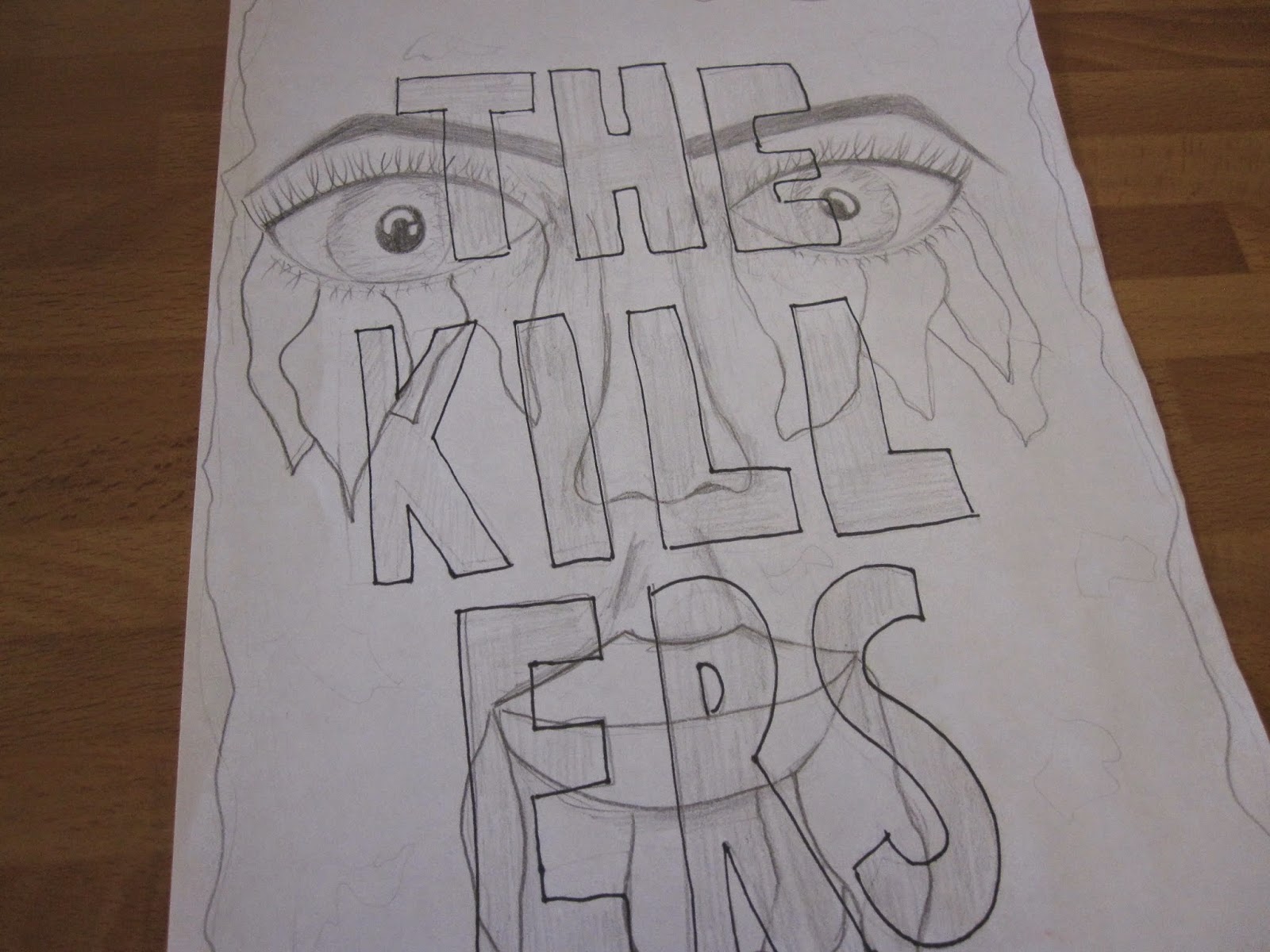
This is my final piece, I have taken my final stage drafting and altered it slightly throughout the process to come up with this piece of work.

Wednesday 15 April 2015

Work in Progress

 I firstly started off by putting my drawings of the eyes into photoshop and editing the threshold. I then used the paintings that I had used and placed these under the eyes.
 Next using the tea stained paper as a background, I lightened the background so it wasn't as harsh and set the page to portrait so that it was more like a poster.
 I then followed the same process but with the drawing that I had done of the lips. I added in the colour and deleted any that leaked over the lips.
 Next I adjusted the levels of the paintings so that it was more vibrant and then the hue to intensify the colour even more, as this was the desired effect that I was after.
 I tried out a series of types for the title until I found this one. I placed it over the majority of the poster and then changed the colour to a vibrant blue. I then changed the blending mode to 'colour burn' which brightened up the colour and also made it more opaque so the eyes, lips and colour was more visible.
 I then played around with the date and location and its whereabouts on the page. I tilted it and changed its position to get a feel for what looked best, and suited the rest of the poster,


Finally, I settled on placing it central because I feel that this looked best due to the whole title being centre aligned.


These are the different components that I drew/ painted and then put together to create my final piece.

Sunday 29 March 2015

Final Stage Drafting


Designer Case Study

Colour Choices


I have taken my emulation and changed all the triangles so that they follow a particular colour scheme. I have done this because it has helped me get a feel of the sort of colours I could go for when choosing and designing my final piece.
The first one I designed is using monochromatic colours, I chose a red/ brown colour and used many different shades of it to fill the triangles.
The second one is using a triadic colour scheme. It is a basic red, blue and yellow scheme where the colours almost block each other out.
For the third, I have used a complementary colour scheme. I have used pinks, purples and blue because they're colours that go well, and I have simply altered the shade of these colours and filled in each triangle with a different one.
Finally, for the fourth one, I have used a full range of prismatic colours. This is my favourite one because it's overall more colourful and more eye-catching so it will suit my theme.
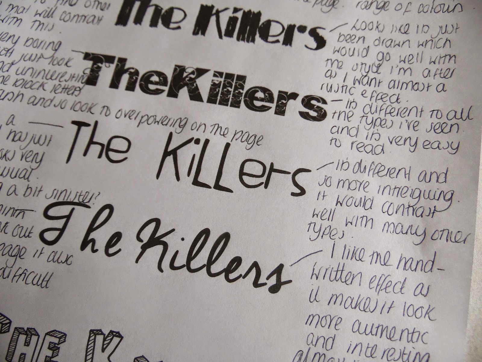
Digital Type


Here are 8 different digital types that I liked. I have made one positive and one negative comment about each type so that I can get a feel of what it is I am looking for for my final design.